
Responsive Web Design
Flawless on every screen.
Responsive Web Design Our Responsive Web Design Expertise
Sites that look and work perfectly on every screen, from phone to desktop.
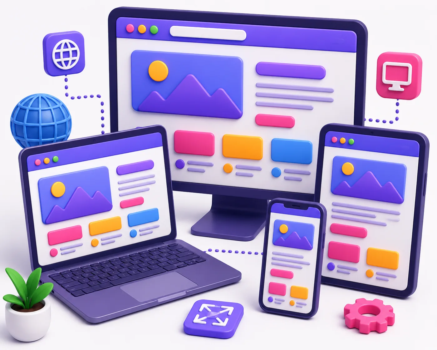
Your visitors arrive on phones, tablets, laptops and desktops — and your site needs to look and work perfectly on all of them. We design responsive, mobile-first websites that adapt seamlessly to any screen size, delivering fast, comfortable experiences everywhere. With most traffic now on mobile, responsive design isn’t optional; it’s essential for usability, SEO and conversions.
Why Choose Pro-Websoftwares for Responsive Web Design
A site that breaks on mobile loses customers and rankings. We design mobile-first, building fluid layouts and touch-friendly interfaces that adapt gracefully from the smallest phone to the largest desktop. We optimise for mobile networks and test across real devices and browsers, so every visitor gets a fast, comfortable experience — which is exactly what users and search engines reward.
What's Included in Our Responsive Web Design
You get mobile-first responsive layouts, fluid grids and flexible imagery, touch-friendly navigation, and performance optimisation for mobile networks. Everything is tested across devices and browsers for a consistent, reliable experience.
Our Responsive Design Process
We design mobile-first, then scale up to larger screens with fluid, flexible layouts. We optimise performance and test across real devices and browsers before launch.
Industries & Use Cases
Responsive design is essential for every website. It underpins web design, UI/UX design, website redesign and SEO.
Responsive Web Design Across the UK, Germany & Belgium
Pro-Websoftwares delivers responsive web design for businesses across the United Kingdom, Germany and Belgium, combining local market insight with international standards. Whether you are a London startup, a Berlin scale-up or a Brussels service provider, you work with a team that understands your goals and market.
From a simple site to a complex platform, we make every screen a great experience. Remote-first collaboration means distance is never a barrier to a hands-on, responsive engagement. Ready to move forward? Get in touch for a free consultation and a tailored proposal.
Frequently Asked Questions
Is responsive design really necessary?
Yes — most traffic is mobile, and search engines rank mobile-friendly sites higher.
Do you design mobile-first?
We start with mobile and scale up, ensuring the smallest screens get a great experience.
Will my site work on all browsers?
We test across devices and browsers for consistent behaviour.
Can you make my existing site responsive?
We can retrofit responsiveness or redesign for a fully mobile-first experience.
Key Features
Related Services
Explore our other professional solutions.
Web Design
At Pro-Websoftwares, we craft modern, user-friendly and aesthetically pleasing websites that captivate your target audience from the very first click. Our design team blends creativity with strategy to build online experiences that reflect your brand and drive real results. From concept to launch, we ensure every pixel serves a purpose that supports your business goals.
Web Development
Pro-Websoftwares delivers robust, scalable and lightning-fast web development built on modern frameworks and clean, maintainable code. We craft custom solutions tailored to your business goals, ensuring performance, security and long-term flexibility. From dynamic web applications to complex integrations, our developers turn ambitious ideas into reliable digital products.
Web Software
We build custom web software that streamlines your operations and scales with your ambitions. From SaaS platforms and dashboards to bespoke CRMs and automation tools, our solutions are engineered for performance and reliability. Every project is tailored to the way your business actually works.